I was asked to suggest improvements for the product promo page for Artbutler Cloud Websites – a tool for building websites for artists and galleries. My recommendations boiled down to experimenting with call-to-action’s, mixing up the imagery and using a combo of content structures.
Understanding the space
The first thing I asked Dirk at Artbutler when I got the assignment was:
When you’ve spoken to gallerists and artists and seen their current sites, what do you think are the 2 main problems they have, the 2 main reasons they stay with what they currently have and 2 main reasons they have a site in the first place?
Dirk’s answers to the high-level questions helped me understand why they have built the tool in the first place. Once I had thought more about the landing page I also needed to understand lots of details and I asked questions such as:
Is Collector and Buyer (basically) synonyms? Do you prefer one word over the other?
Call-to-action’s
Artbutler has a sales person, Tim. But one can also sign up for a trial directly on the site and start building ones website. Which approach will generate most sales after the trial period – going via Tim or signing up via the form – is still unknown. My suggestion is to create two CTA’s – Contact Tim and Sign up for a trial – and evaluate them over time.
The wording of call-to-actions should be tested. And they are so easy to test. It is necessary to create good candidates, but once they are written Optimizely or Visual Website Optimizer basically does the job for you when it comes to deciding which CTA text to use. I suggested a bunch of texts and my advice to Artbutler is to test them in multivariate tests. Some examples:
- Contact us
- Let Tim help you get started
- Start a free trial
- Chat with us about your site
Imagery
The page has several screen-shots of sites built with the tool. My suggestion is to complement the screen-shots with images of persons using the sites and display some screen-shots on Android and PC devices (currently all are on Apple products).
Structures
Recently I’ve thought much about how content can be structured. For this page I suggested a combo of News style and Andy Raskin’s Musk structure.
The page starts with a strong subheading and then talk about the “enemy” – developers who don’t understand the intricacies of the art market. Then comes a News style summary of the remaining content. News style also dictates that an indirect and direct quote be included in the summary – in this case my suggestion is that the quote is from “We” as in Artbutler. The preamble ends by showing “the promised land” – examples of sites built with the tool – and the first Call-to-action.
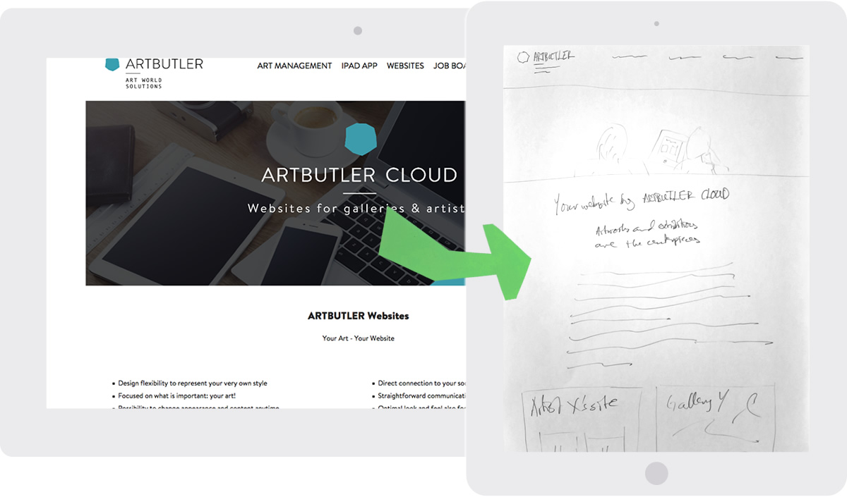
My draft for the beginning of the page:
Hero image
We look over the shoulders of two persons looking at a website built with the tool
Heading
Your website by ARTBUTLER CLOUD
Subheading
Artworks and exhibitions are the centrepieces.
Preamble
As a gallery or artist the website is a major part of your business. Collectors use it to get deep information about the works you have available. You use it to show off your full inventory, without the limitations of physical space. Yet art websites are often built by developers who do not understand the intricacies of the art world. Until now.
We started by realizing that works and exhibits are the foundation of a valuable art site. In ARTBUTLER CLOUD we help you to create rich descriptions of your art pieces and exhibits. You choose a theme and customize the style of your website. No matter which screen your collectors are visiting your site on – phone, tablet, or computer – it is beautiful. We will help you create a site where the art is front and center.
Examples
Screen-shots and links to one or two demo sites.
Call-to-action
The CTA’s as above.
The main content expands on the main benefits of the tool, as discussed in the preamble. Heading are for example “Your works, in detail”, “Gallery or Artist”, “Your brand on all screens” and “Help collectors communicate with you”.
I also suggest that 2 or 3 testimonials from current customers be included, more info on social media integration, security and other Artbutler tools as well as detailed info on tool pricing.
The Artbutler team where positive to the suggested new structure. They will build a page according to this structure and A/B test against their current page. I like that a lot – it’s important that we prove that things work, not just believe that they do!