Using the same volume of water for all flushes is wasteful. Perhaps using water at all is too wasteful for the planet. But using a toilet where there is a choice of a small or a big flush is, I imagine, a small step forward.
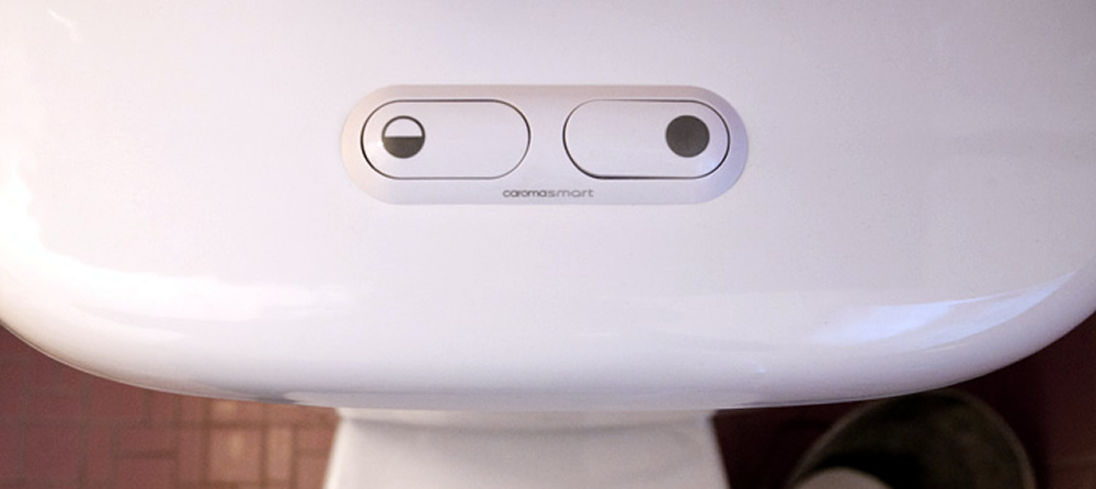
In 1982 the Australian company Caroma created the first dual flush toilet. It had two separate physical buttons, as seen in it’s updated current design above. Since then various toilet manufacturers have created variations of this concept. However, the quality of the interaction/industrial design of them vary greatly.
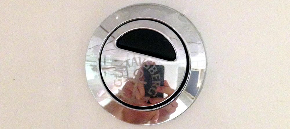
All dual flush systems need to indicate how to choose a big or small flush. Many companies make the mistake of printing symbols on the button. Since the button is constantly touched, the paint may rub off, as seen in the above photo. Which side of the lever should I push to get a small flush?

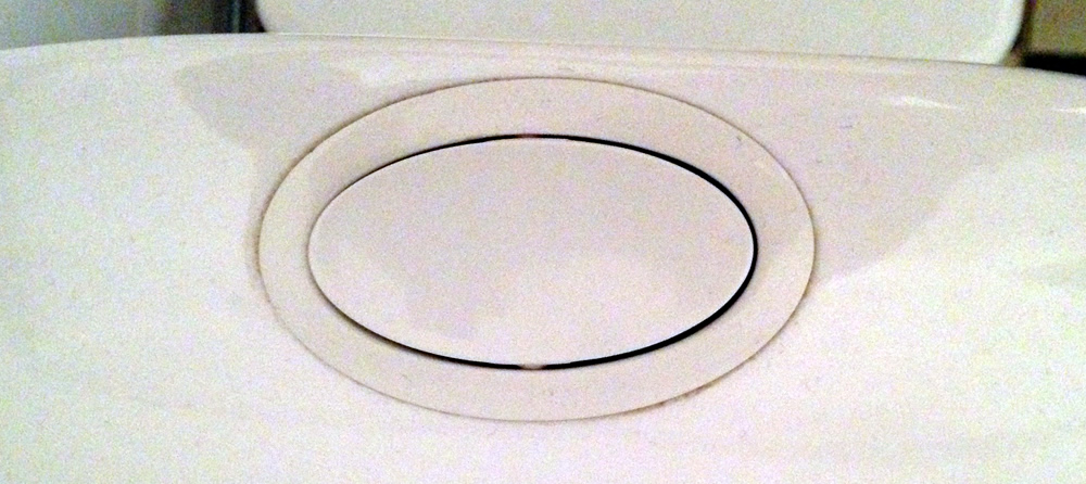
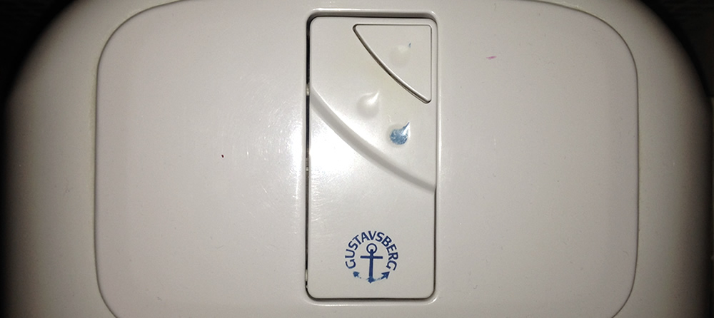
A way to avoid the paint problem, and help persons with low level of eye sight, is to include the symbols in the mold for the button. This increase durability and that it is haptic is great. One drawback might be cleaning, as the symbols have ridges that can make washing the button a bit more difficult.
However, also raised symbols can fade and disappear.
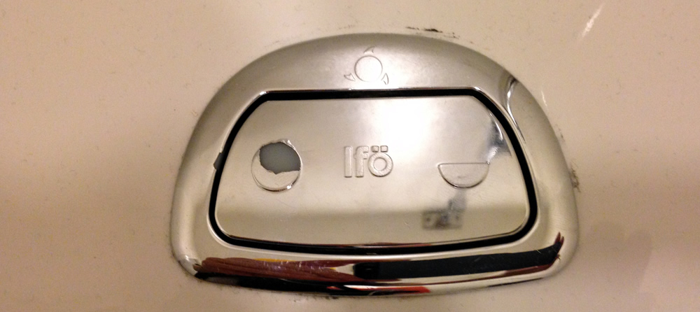
This is the flush button that inspired this whole series of examinations of bathroom UX.
The main button has a hole with an inner column. One can press the main button only, or include the column in the press. However, I have never been able to figure out which of the two options give the small flush. Pressing main and column is a more force-ful action so it feels like it might give a big flush. But, pressing only the main button is more difficult and since the purpose of the system is to more often flush small, pressing the main button and the column (the easier action) should do a small flush.
Here we see two problems – the paint is withering and the button has the interpretation problem caused by the smaller column inset in the main button. To the designers credit, this system has “hapticity” so despite the paint fading one may be able to “read” the symbols. Interpreting them and understanding how to do a small or big flush is however still difficult.
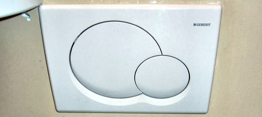
Wall mounted flush buttons have the problem of hiding and thus abstracting the flushing system. However, identifying the small and the big flush button on the panel is easy – probably even for a blind person.
Tomorrow: Faucets for the disabled are the best!